 若熙站点
若熙站点  时歌的博客
时歌的博客576 字
3 分钟
Flutter按钮组件
Flutter 按钮组件
按钮组件
按钮组件的属性
| 属性 | 说明 |
|---|---|
| onPressed | 必填参数,按下按钮时触发的回调,接收一个方法,传 null 表示按钮禁用,会显示禁用相关样式 |
| child | 子组件 |
| style | 通过 ButtonStyle 装饰 |
ButtonStylee 里面的常用的参数
| 属性名称 | 值类型 | 属性值 |
|---|---|---|
| foregroundColor | Color | 文本颜色 |
| backgroundColor | Color | 按钮的颜色 |
| shadowColor | Color | 阴影颜色 |
| elevation | double | 阴影的范围,值越大阴影范围越大 |
| padding | 内边距 | |
| shape | 设置按钮的形状 shape: MaterialStateProperty.all( RoundedRectangleBorder( borderRadius: BorderRadius.circular(10)) ) | |
| side | 设置边框 | MaterialStateProperty.all(BorderSide(width:1,color: Colors.red)) |
ElevatedButton
ElevatedButton 即”凸起”按钮,它默认带有阴影和灰色背景。按下后,阴影会变大
ElevatedButton(
onPressed: () {},
child: const Text("普通按钮")
)
TextButton
TextButton 即文本按钮,默认背景透明并不带阴影。按下后,会有背景色
TextButton(
child: Text("文本按钮"),
onPressed: () {},
)
OutlinedButton
OutlineButton 默认有一个边框,不带阴影且背景透明。按下后,边框颜色会变亮、同时出现背景和阴影
OutlinedButton(
child: Text("边框按钮"),
onPressed: () {},
)
IconButton
IconButton 是一个可点击的 Icon,不包括文字,默认没有背景,点击后会出现背景
IconButton(
icon: Icon(Icons.thumb_up),
onPressed: () {},
)
带图标的按钮
ElevatedButton 、TextButton 、OutlineButton 都有一个 icon 构造函数,通过它可以轻松创建带图标的按钮
class MyHomePage extends StatelessWidget {
  const MyHomePage({super.key});
  _onPressed() {
    print('object');
  }

  @override
  Widget build(BuildContext context) {
    return Column(
      children: [
        ElevatedButton.icon(
          icon: const Icon(Icons.send),
          label: const Text("发送"),
          onPressed: _onPressed,
        ),
        TextButton.icon(
          icon: const Icon(Icons.info),
          label: const Text("详情"),
          onPressed: _onPressed,
        ),
        OutlinedButton.icon(
          onPressed: _onPressed,
          label: const Text("增加"),
          icon: const Icon(Icons.add),
        )
      ],
    );
  }
}
修改按钮的宽度高度
 SizedBox(
          height: 80,
          width: 200,
          child: ElevatedButton(
            style: ButtonStyle(
                backgroundColor: WidgetStateProperty.all(Colors.red),
                foregroundColor: WidgetStateProperty.all(Colors.black)),
            onPressed: () {},
            child: const Text('宽度高度'),
          ),
 ),
自适应按钮
 Row(
          mainAxisAlignment: MainAxisAlignment.center,
          children: <Widget>[
            Expanded(
              child: Container(
                height: 60,
                margin: const EdgeInsets.all(10),
                child: ElevatedButton(
                  child: const Text('自适应按钮'),
                  onPressed: () {
                    print("自适应按钮");
                  },
                ),
              ),
            )
          ],
 ),
配置圆形圆角按钮
ElevatedButton(
    style: ButtonStyle(
        backgroundColor: WidgetStateProperty.all(Colors.blue),
        foregroundColor: WidgetStateProperty.all(Colors.white),
        elevation: WidgetStateProperty.all(20),
        shape: WidgetStateProperty.all(RoundedRectangleBorder(
            borderRadius: BorderRadius.circular(10))),
    ),
    onPressed: () {
        print("圆角按钮");
    },
    child: const Text('圆角')),
圆形按钮
SizedBox(
    height: 80,
    child: ElevatedButton(
        style: ButtonStyle(
            backgroundColor: WidgetStateProperty.all(Colors.blue),
            foregroundColor: WidgetStateProperty.all(Colors.white),
            elevation: WidgetStateProperty.all(20),
            shape: WidgetStateProperty.all(
                const CircleBorder(side: BorderSide(color: Colors.white)),
            )),
        onPressed: () {
            print("圆形按钮");
        },
        child: const Text('圆形按钮')),
),
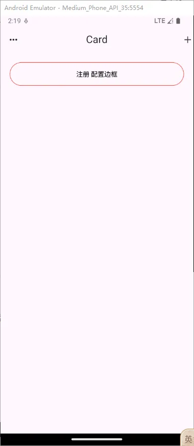
修改 OutlinedButton 边框
Row(
    mainAxisAlignment: MainAxisAlignment.center,
    children: <Widget>[
        Expanded(
            child: Container(
                margin: const EdgeInsets.all(20),
                height: 50,
                child: OutlinedButton(
                    style: ButtonStyle(
                        foregroundColor: WidgetStateProperty.all(Colors.black),
                        side: WidgetStateProperty.all(
                            const BorderSide(width: 1, color: Colors.red))),
                    onPressed: () {},
                    child: const Text("注册 配置边框")),
            ),
        )
    ],
),